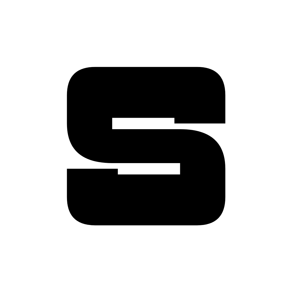
The SatisCorp mark.
A bold S: simple, small and easy to keep. Logo files are below.





Five ideas behind every choice.
SatisCorp started from one frustration: AI creeping into everything. The answer was to build tools that stay simple, stay offline and belong to the people who use them. These five words guide the design as much as the code.
Tools you can understand. Few features, done well, easy to read and to run.
Everything works without the internet. Nothing needs a server to start.
Your files, your machine, your settings. No account, no lock-in.
Clear words and calm design. We explain what a tool does and what it does not do.
Open source and free, so anyone can read the code, and check what we say.
How to write it.
One word, two capital letters, no space. The tools share the “Satis” start so they read as a family: Code, Reader, Docs, Palette.
Built on a simple grid.
The mark sits on a 64 by 64 grid. Every corner is rounded with the same radius, and the two bars of the S are the same thickness. That makes it easy to redraw at any size.
What to keep in mind
- Square proportions. The mark is 56 units wide and 56 tall, with 4 units of margin inside its box.
- Heavy and flat. One solid colour, no outline, no gradient inside the mark.
- Readable small. It stays clear down to 16 pixels, so it works as a favicon.
- One shape. The two bars of the S line up exactly on the grid, so keep them aligned if you redraw it.
The mark on every background.
On colour, use black or white, whichever has the stronger contrast. Never place the mark on a busy photo.
The mark and the name together.
Use the horizontal lockup first. Use the stacked one only where the space is square, like a profile card. The mark alone is fine when the name is already nearby.
From favicon to app icon.
 16px32px48px64px96px180px
The app icon is the mark in white on a black rounded square, with a faint edge. It is the same file everywhere: browser tab, home screen and the installer.
One colour for each tool.
Each product keeps the SatisCorp mark and takes one accent colour. The accent appears as a thin line, a dot or a highlight, never as a full background for text.
Black, white, and a little colour.
The site is mostly black and white, with a light theme that swaps them. Colour is kept for meaning: one accent per product, red for errors, green for success.
Dark theme neutrals
#000000Page background, dark#050505Cards#0A0A0APanels#111111Chips, inputs#EDEDEDMain text, dark#A1A1A1Secondary text#8A8A8ALabels, captions#FFFFFFStrong text, buttonsLight theme neutrals
#FAFAFAPage background, light#F4F4F5Cards#EFEFF1Panels#E6E6E9Chips#171717Main text, light#4F4F55Secondary text#707078Labels#000000Strong text, buttonsAccents
#FF8A3DSatisCode#52A8FFSatisReader#50E3C2SatisDocs#BF7AF0SatisPalette#FF6166Errors and warnings#F5A623CautionsContrast, measured
| Pair | Colours | Ratio | WCAG |
|---|---|---|---|
| Aa Main text on black | #EDEDED on #000000 | 17.9 : 1 | AAA |
| Aa Secondary text on black | #A1A1A1 on #000000 | 8.1 : 1 | AAA |
| Aa Labels on black | #8A8A8A on #000000 | 6.1 : 1 | AA |
| Aa White on black | #FFFFFF on #000000 | 21.0 : 1 | AAA |
| Aa Ink on paper | #171717 on #FAFAFA | 17.2 : 1 | AAA |
| Aa Muted on paper | #4F4F55 on #FAFAFA | 7.8 : 1 | AAA |
| Aa Dim on paper | #707078 on #FAFAFA | 4.7 : 1 | AA |
| Aa Orange on black | #FF8A3D on #000000 | 9.0 : 1 | AAA |
| Aa Blue on black | #52A8FF on #000000 | 8.4 : 1 | AAA |
| Aa Green on black | #50E3C2 on #000000 | 13.1 : 1 | AAA |
| Aa Violet on black | #BF7AF0 on #000000 | 7.3 : 1 | AAA |
| Aa Black on orange | #000000 on #FF8A3D | 9.0 : 1 | AAA |
Ratios use the WCAG 2 formula. AA needs 4.5 : 1 for normal text. Accent colours are for lines, dots and large text on black, and as backgrounds under black text.
Copy the variables.
These are the real values used by this website. Paste them in a project and it will match.
/* SatisCorp design tokens: dark theme (default) */
:root{
  --bg:#000;  --s0:#050505; --s1:#0a0a0a; --s2:#111;
  --ink:#ededed; --muted:#a1a1a1; --dim:#8a8a8a;
  --line:rgba(255,255,255,.10); --line2:rgba(255,255,255,.20);
  --ok:#50e3c2; --font:'Geist',system-ui,sans-serif; --mono:'Geist Mono',ui-monospace,monospace;
}
/* Light theme */
html[data-theme="light"]{
  --bg:#fafafa; --s0:#f4f4f5; --s1:#efeff1; --s2:#e6e6e9;
  --ink:#171717; --muted:#4f4f55; --dim:#707078;
  --line:rgba(0,0,0,.12); --line2:rgba(0,0,0,.24); --ok:#067a62;
}
/* Product accents */
--satiscode:#ff8a3d; --satisreader:#52a8ff; --satisdocs:#50e3c2; --satispalette:#bf7af0;Round, even and calm.
Corners are generously rounded and the same family of numbers is used everywhere. Edges are drawn with a faint 1 px line instead of heavy shadows.
Corner radius
Spacing
Borders
Geist, and nothing else.
Geist
LightRegularSemiboldExtra bold
ABCDEFGHIJKLMNOPQRSTUVWXYZ
abcdefghijklmnopqrstuvwxyz
0123456789 .,:;!?&@#%
Geist Mono
RegularSemibold
git clone https://github.com
const answer = 42;
0123456789 -> => !=
Tight spacing on large headings, normal spacing on text. Both fonts are free (SIL Open Font License) and served from this site.
Simple lines, no decoration.
Icons are outlines that inherit the text colour, so they work on any background and in both themes.
Click an icon to copy its SVG. They are drawn on a 24 px grid with a 1.8 px line, round ends and no fill. Use the same line weight for any new icon.
The pieces we use.
Nothing here is sent anywhere.
git cloneMotion explains, it does not decorate.
Short movements for actions, longer ones for scenes. Everything has a reason: to show where something came from or what changed.
Rules
- Easing:
cubic-bezier(.3,.7,.3,1)for most movement. It starts fast and settles gently. - Respect the setting. With “reduce motion” on, animations are removed or shortened.
- One main moment per page. A scroll scene, a reveal or a small toy, never all at once.
- The logo reveal is the liquid glass animation. It plays once per visit.
Real screens, no stock photos.
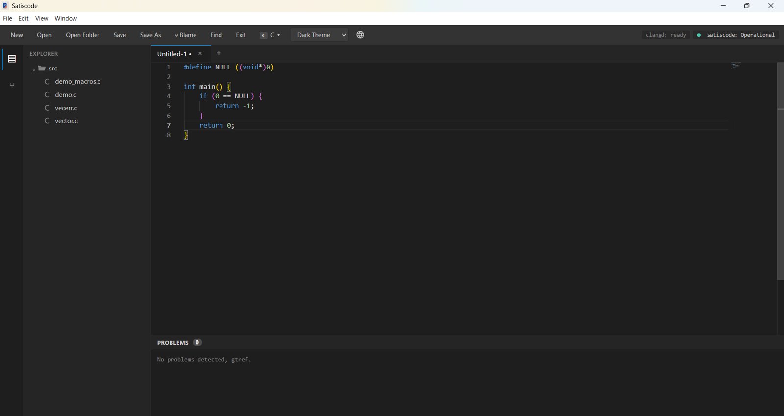
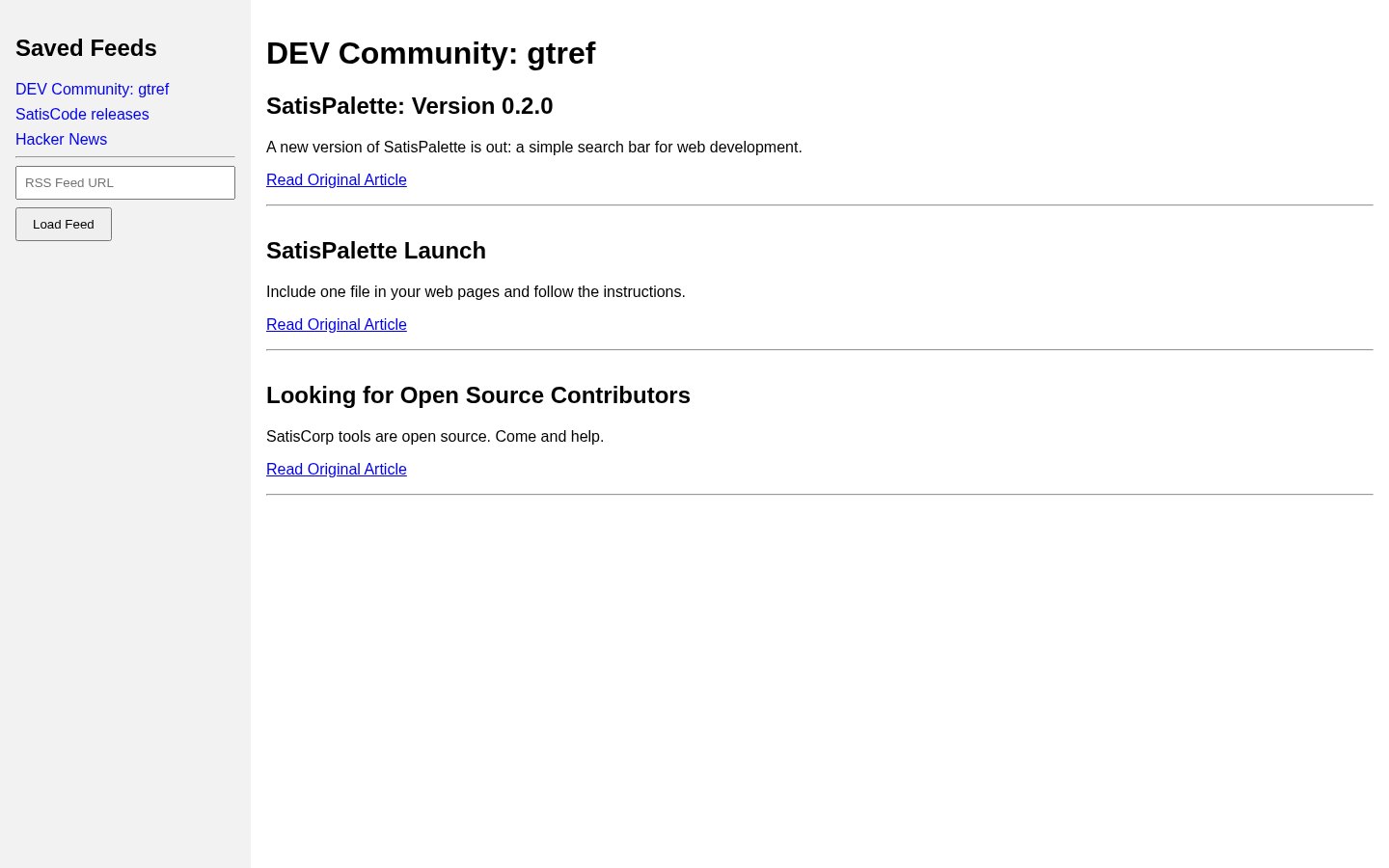
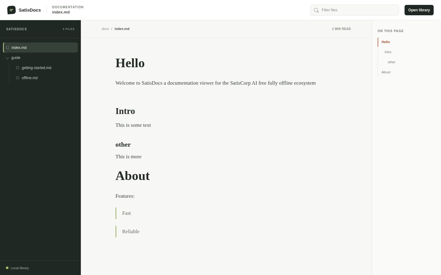
The best picture of a tool is the tool.
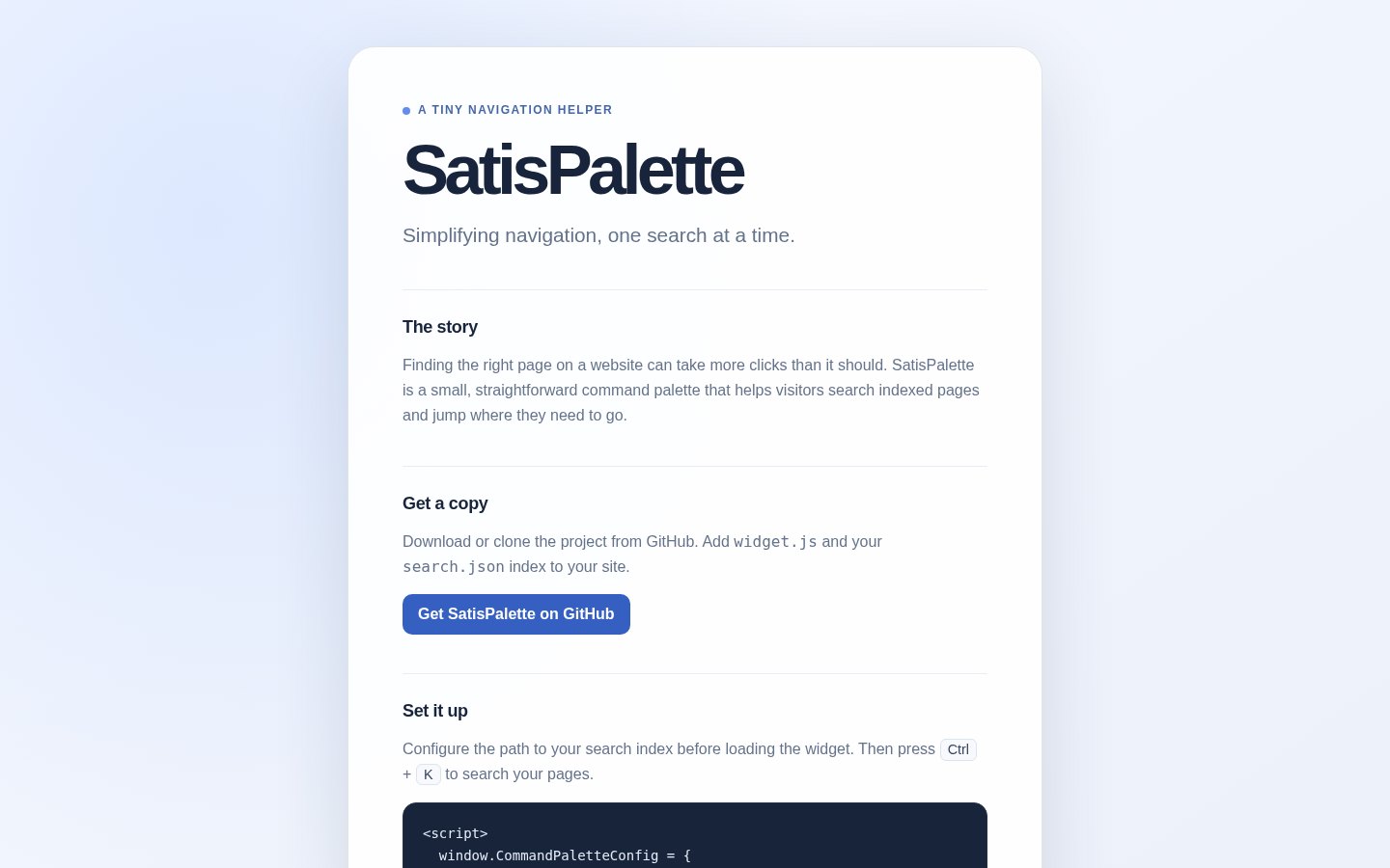
How we show things
- Show the real application, not a mock. Keep the window frame and the real text.
- Put it in a rounded frame with a thin line, and the product accent as a 5 px strip on top.
- Prefer 3D scenes made from real interface parts over stock photos or generic illustrations.
- No photos of people unless they are the people who made the tool, with their agreement.
Plain, calm and honest.
We write
- Short sentences and everyday words.
- What a tool does, and what it does not do.
- “Nothing is sent anywhere” and then prove it.
- Names of things as people see them, like “SatisCode Web”.
We avoid
- Hype words: “revolutionary”, “next-generation”, “seamless”.
- Claims we cannot show, and made-up numbers.
- Fear about AI. We explain our choice and let people decide.
- Exclamation marks and emoji in the interface.
The brand in the places people meet it.
 SatisCode · SatisCorp
Runs offline. Nothing is sent anywhere.
An editor with no AI and no telemetry.
MIT WindowsShow what you stand for.
Four small badges made the same way as the rest of the brand.
Paste the HTML on a website or the Markdown in a README. The snippets already point to the files on this website. When SatisCorp has its final address, change it in the link. The badges are plain SVG files made for SatisCorp, so no other service is involved.
A simple signature.
Name, role, site and the mark. Nothing else: no quotes, no long disclaimers.

Role, SatisCorp
satiscorp.example
<table cellpadding="0" cellspacing="0" style="font-family:Arial,sans-serif;font-size:14px;color:#171717"><tr><td style="padding-right:14px"><img src="https://livepreview.usecartouche.com/satiscorp/brand/social/avatar-400.png" width="56" height="56" alt="SatisCorp" style="border-radius:12px"></td><td><b>Your name</b><br>Role, SatisCorp<br><a href="https://livepreview.usecartouche.com/satiscorp/" style="color:#171717">livepreview.usecartouche.com/satiscorp</a></td></tr></table>Designed to be used by everyone.
Contrast ratios are measured in the table above. The rest is built into every component.
Focus
Every control shows a clear outline when reached with the keyboard.
Colour is never alone
Status uses an icon or a word as well as a colour. Green means success, and so does the word “success”.
Size and space
- Body text at 16 px or more.
- Touch targets at least 38 px.
- Line length under 70 characters.
Motion and sound
- “Reduce motion” is respected everywhere.
- Nothing plays sound on its own.
- Everything works with the keyboard.
How the site looks when you share it.
A few simple rules.
Colours
#000000White #FFFFFFSoft white #EDEDEDGrey #A1A1A1Clear space
Keep a margin around the mark equal to half its width. Nothing else should enter that space.
Questions about using the brand.
Can I use the logo in an article or a video?
Yes, to talk about SatisCorp or one of its tools. Use the files from the brand kit, unchanged, and link to the project when you can. These are suggested terms: they apply once SatisCorp confirms them.
Can I change its colours?
Use black or white, whichever contrasts best with the background. The product accents are for the tools themselves.
Can I put it on a T-shirt or a product I sell?
Please ask first. Open an issue or write to the team through the contact page.
Which file should I use?
For websites use the SVG. For documents and slides use the PNG at 1024 px. For app icons and favicons use the icon files in the kit.
The logo looks too heavy on my background.
It is meant to be bold. If it is overwhelming, make it smaller and keep the clear space, rather than thinning it out.
Who do I ask about anything else?
Use the contact page. A short message is enough.
How the brand got here.
The earlier mark, an S inside a circle, was replaced by a single solid S on a grid. It is simpler, reads at 16 px and fits the black and white look of the site.
Logo files, icons, social images, badges and design tokens collected in one place.
Ready-made images.
Click an image to download the full size. They are plain black with the mark, so they work on any platform that crops to a circle or a banner.